Ready to build something your competitors will want to copy?
kate@kate-reeves.com

If your brand uses Inter and Playfair Display, I'm not judging you. But I am saying you're not alone. Very, very not alone.
Google Fonts adds new typefaces regularly, and most of them don't get the traffic they deserve because designers go back to the same 20 fonts out of habit. Here are pairings built from recently added or chronically underused fonts that are actually good — and won't make your site look like it was generated from a Webflow template.

Instrument Serif is elegant without being precious. It has contrast and character but doesn't shout. Paired with DM Sans (clean, slightly geometric, very readable at small sizes), this combo works well for editorial layouts, brand strategy sites, and anything that needs to feel authoritative without being stiff. Try Instrument Serif at large display sizes with DM Sans handling body copy at 400 weight.
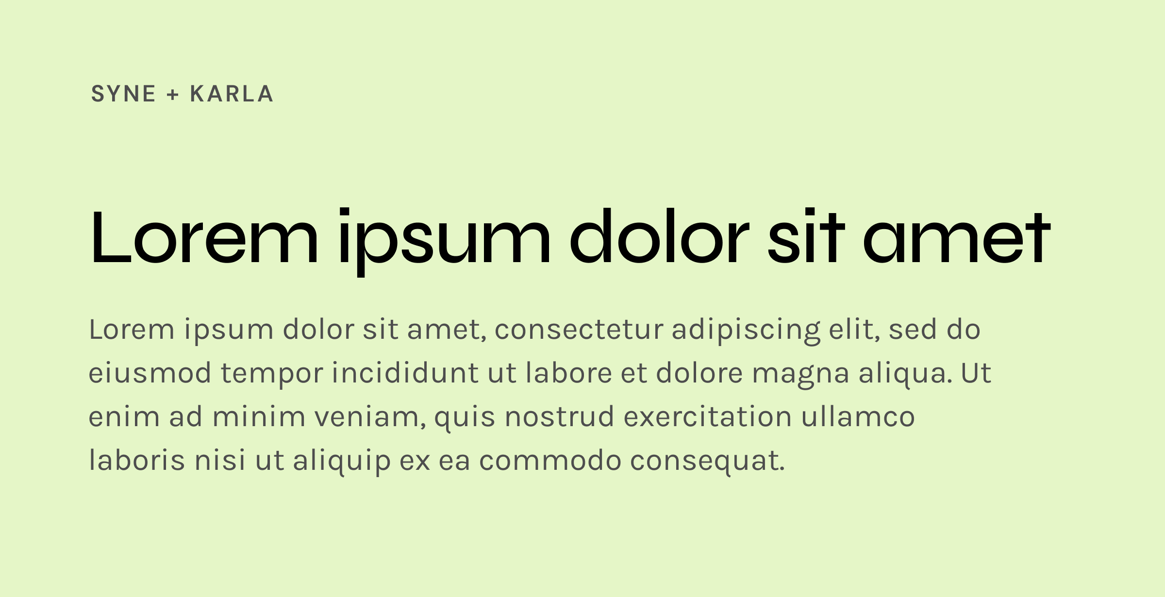
Syne is a display font with an almost brutalist edge — wide tracking, strong geometry. It's been around for a few years but remains underused relative to how good it is. Karla is warm and humanist, which creates useful tension. Good for agencies, product companies with a design-forward identity, or anyone who wants to feel a little more interesting than their competitors.
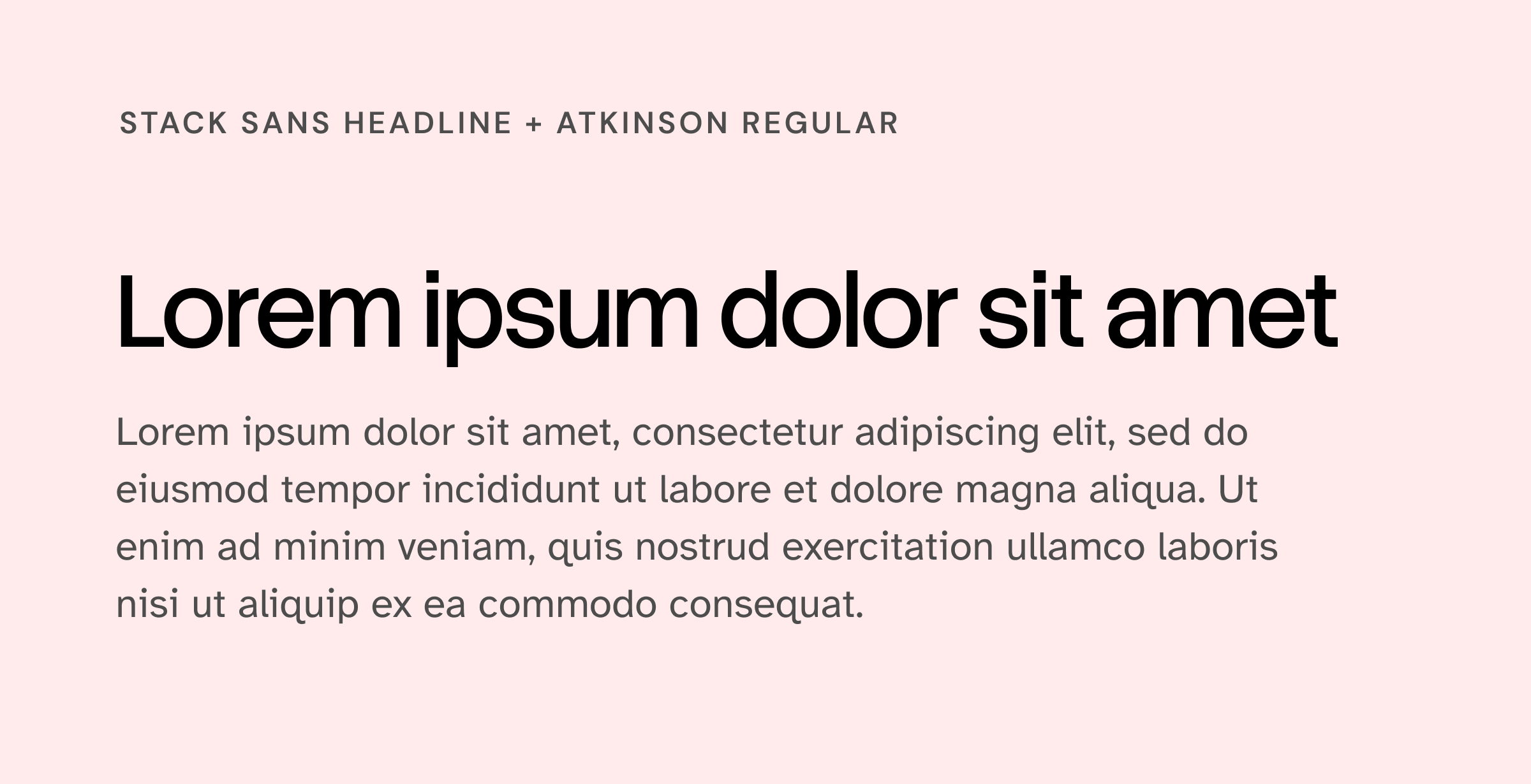
Stack Sans Headline was built for Stack Overflow — modernist, structured, no unnecessary detail. Atkinson Hyperlegible was designed with accessibility as the primary brief, which means it performs at every size without effort. Together they're a sharp choice for technical brands or SaaS products where clarity is the whole point.
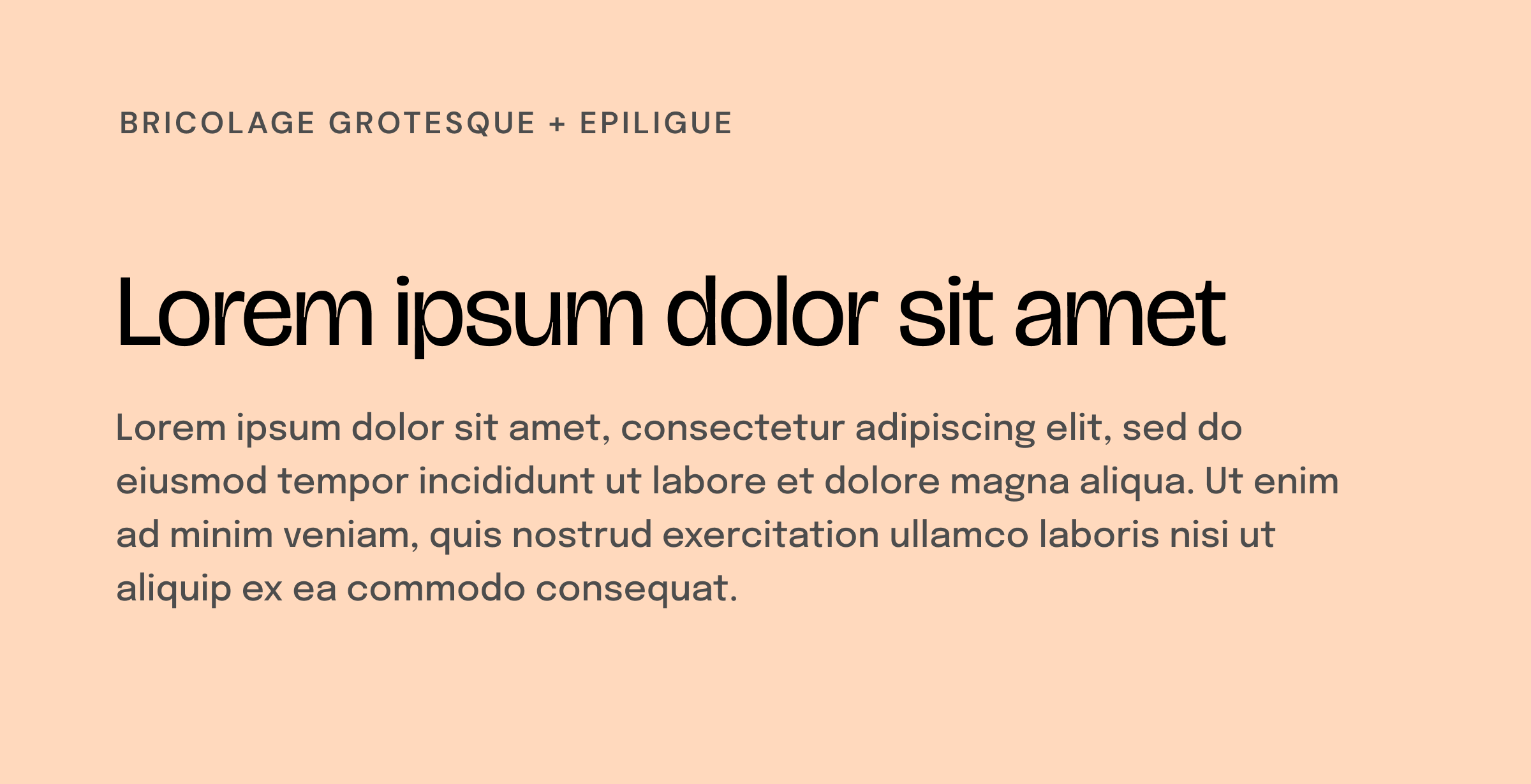
Bricolage Grotesque was added more recently and it shows — it feels current in a way that a lot of grotesque fonts don't. Variable, expressive, works well at display sizes. Epilogue is a clean, contemporary sans-serif with good weight range. The combination is sharp without feeling cold.
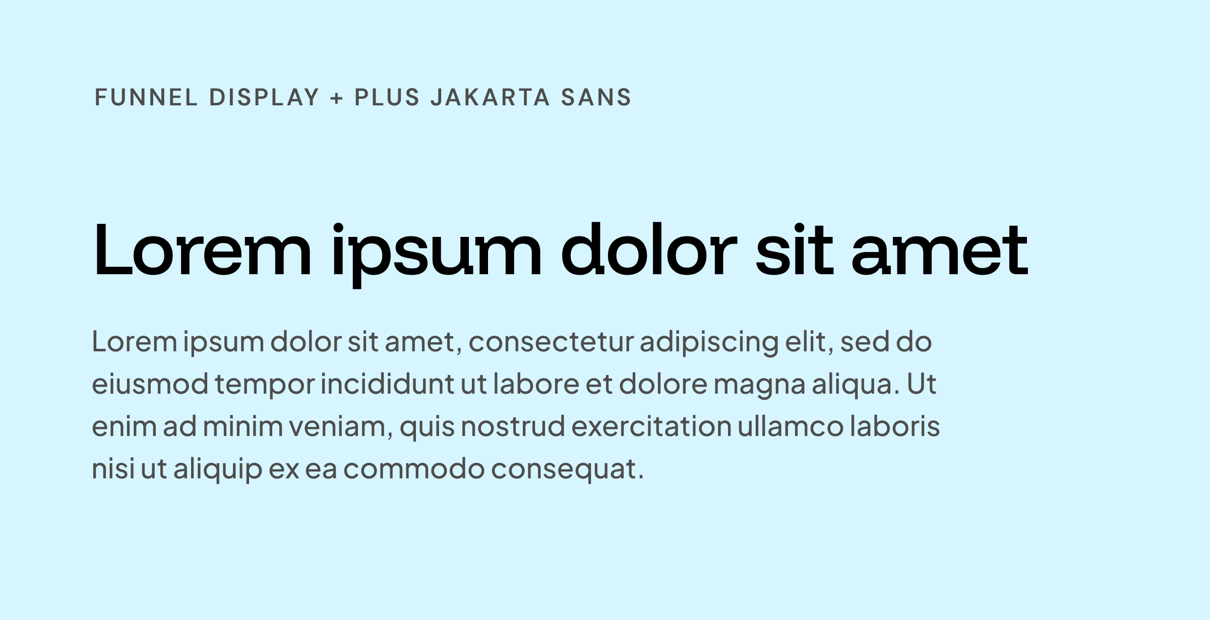
Funnel Display has a geometric quality that reads editorial without trying too hard. Plus Jakarta Sans is versatile and modern — a reliable utility font that doesn't compete. This pairing reads well across marketing sites and long-form content.
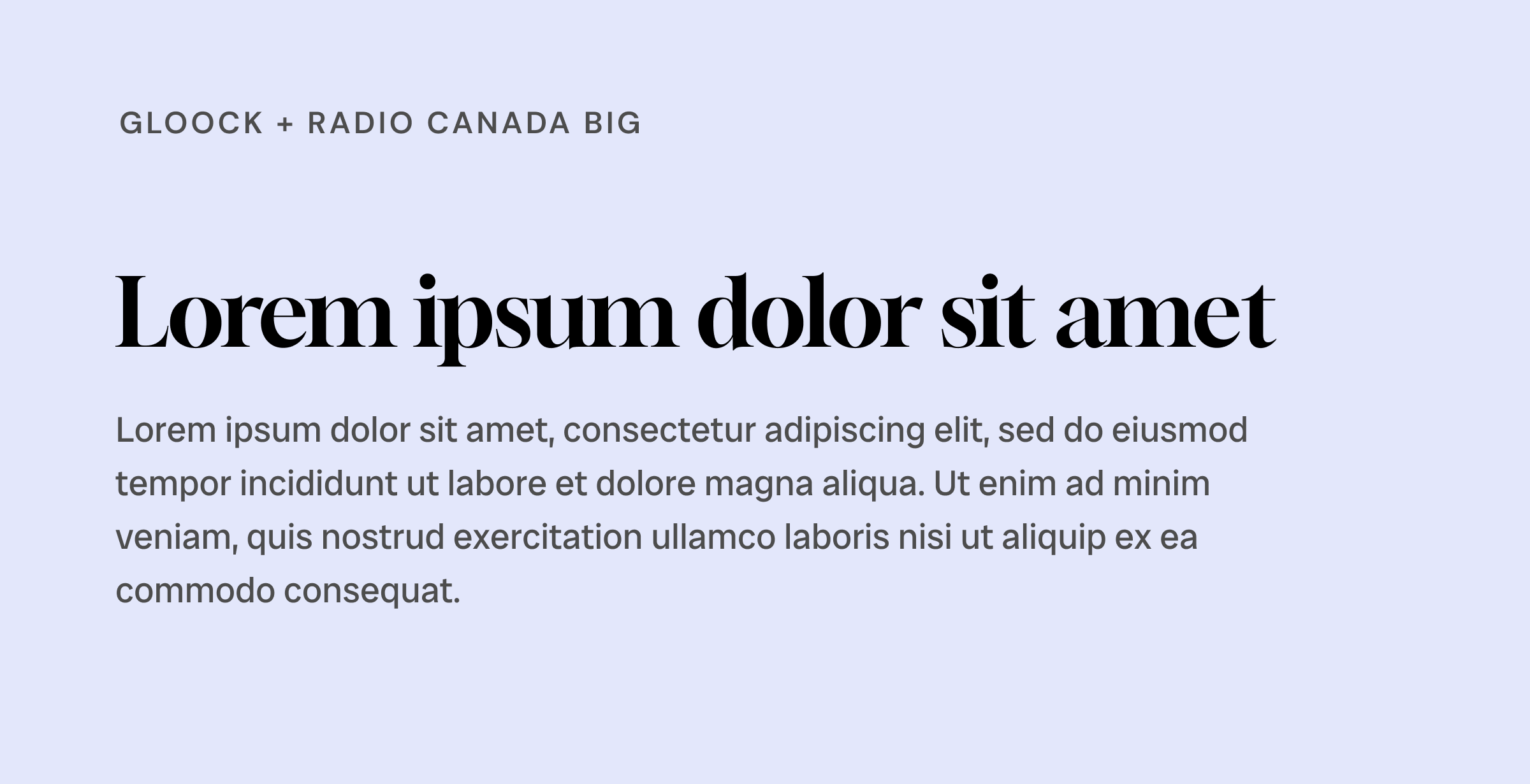
Gloock is a high-contrast editorial serif — sharp, elegant, a little dramatic at display sizes in a way that earns it. Radio Canada Big brings enough weight as a sans to balance it without flattening it. This pairing has a point of view. Good for brands that actually want one.
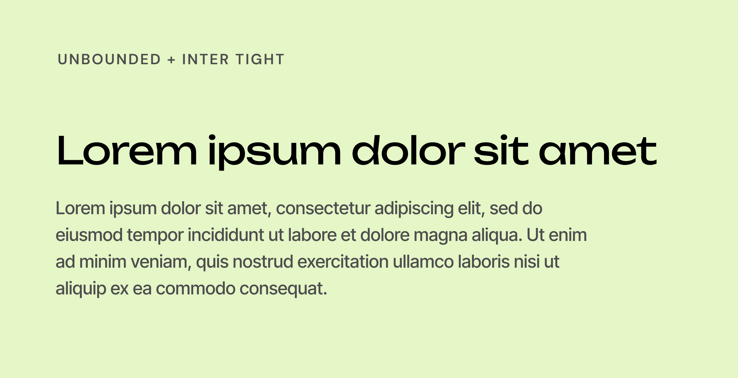
Unbounded is wide, geometric, and makes a statement before anyone reads a word. Inter Tight keeps the body grounded. Good for emerging tech, anything forward-facing, or brands that are done being polite about their ambitions.
Type choices only matter in context. A font that looks great in one layout can fall apart in another. Before you commit to a pairing, test it at the sizes and weights you'll actually use — large display headline, medium subheader, small body copy, tiny caption. That's the real test.
If you're using these on a brand that has existing equity, pair carefully. A dramatic type change reads as a rebrand signal even when you don't mean it to.
And if you want to go deeper on variable fonts specifically — Fraunces and Bricolage Grotesque both have real range — Google Fonts has a decent variable font explorer built into the specimen pages. Worth spending 20 minutes there before you decide.