


Ready to build something your competitors will want to copy?
kate@kate-reeves.com


It failed to reflect their enterprise-level credibility or, more importantly, the human-centered care that sits at the core of everything they do. The result was a brand that undersold their impact and created distance from the very patients and partners they were trying to reach.

The new identity needed to feel sophisticated enough to resonate with enterprise decision-makers, warm enough to reflect their patient-first philosophy, and distinct enough to stand out in a competitive market.

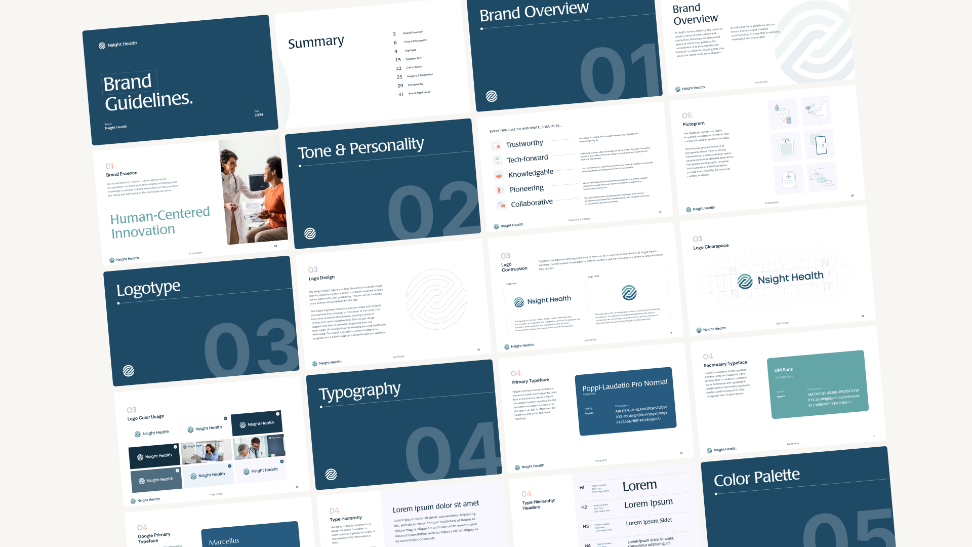
Through rounds of collaborative refinement, the team landed on a central concept: "Parts of a Whole: A 360° View of Patient Care" — an idea that put patients at the center and emphasized reassurance, connection, and confidence. From there, the visual identity was built from the ground up: 56 logo mark explorations, a refined color palette, typography, imagery, iconography, and a cohesive tone of voice — all anchored to the brand pillars of trustworthiness, expertise, and collaboration.

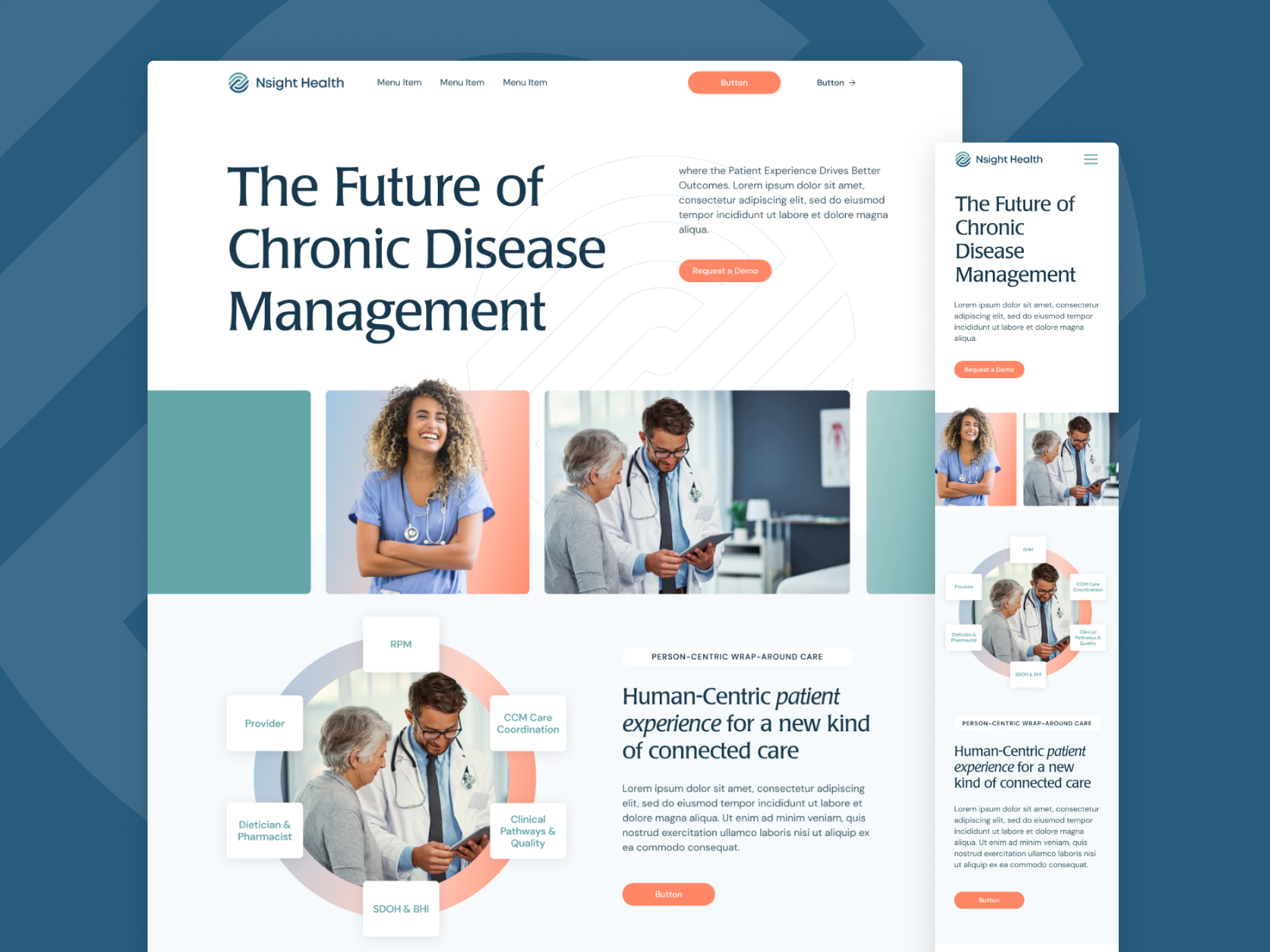
The new identity clearly differentiates them from competitors, strengthens their position as a trusted enterprise solution, and — most importantly — reflects the human care at the heart of their work. Nsight now shows up in the market as the empathetic, tech-forward partner they've always been.